Alchemist Brewery
School Project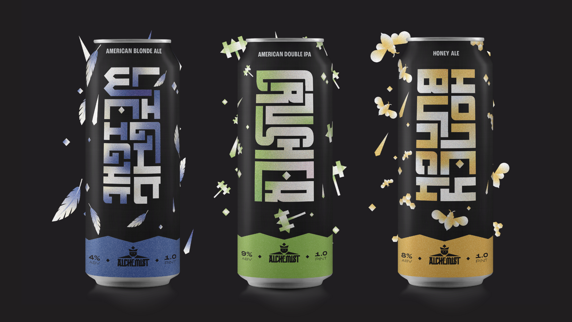
Alchemist
Brewery
Small by Mighty the Alchemist Brewery is here to stay
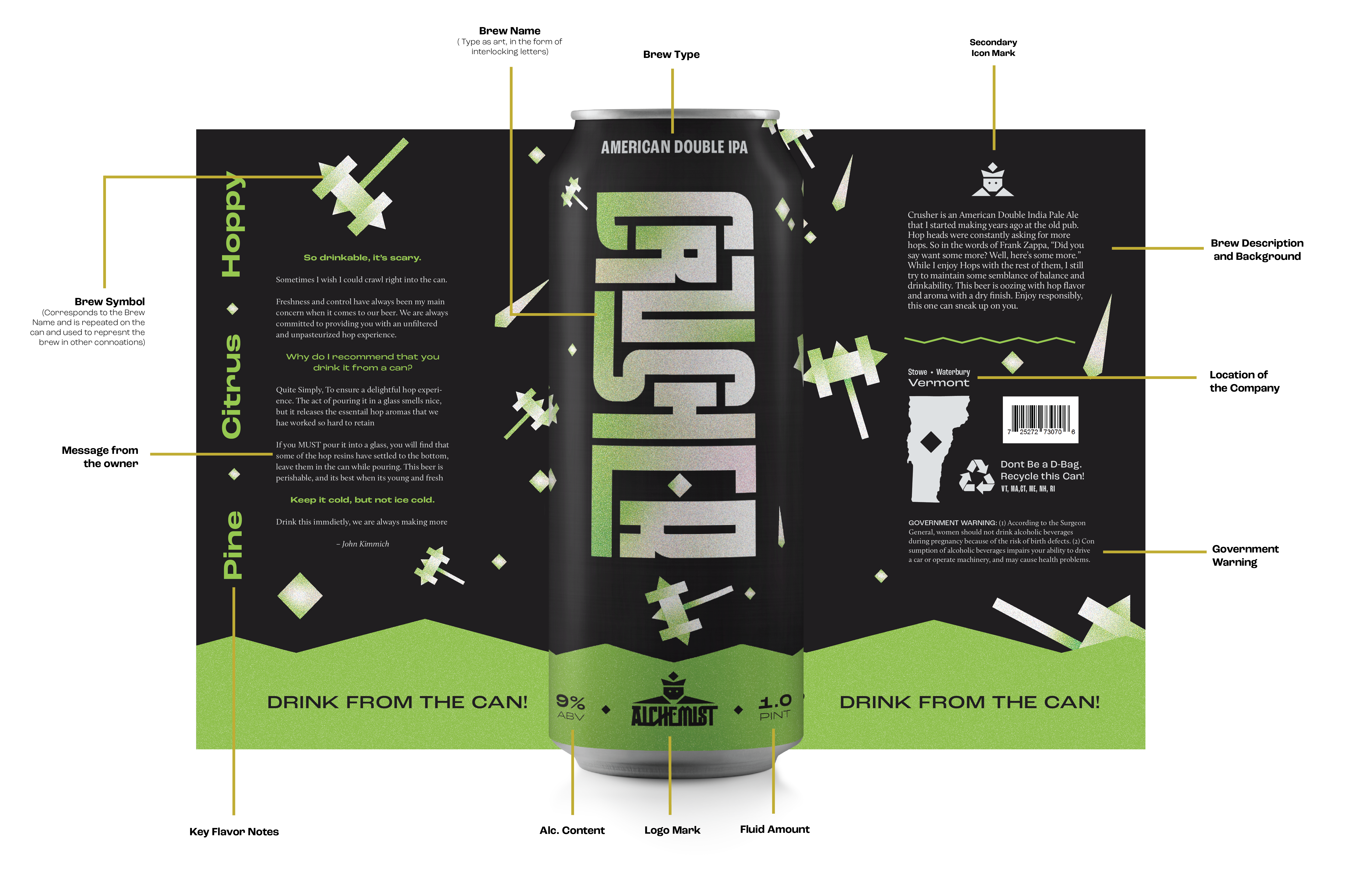
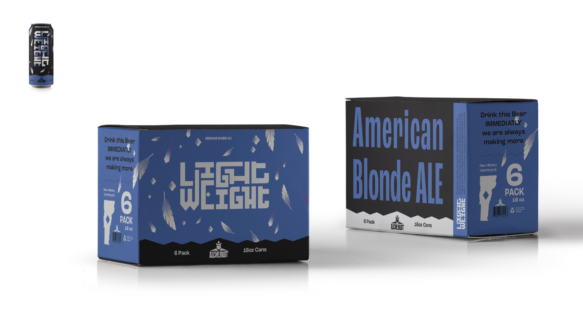
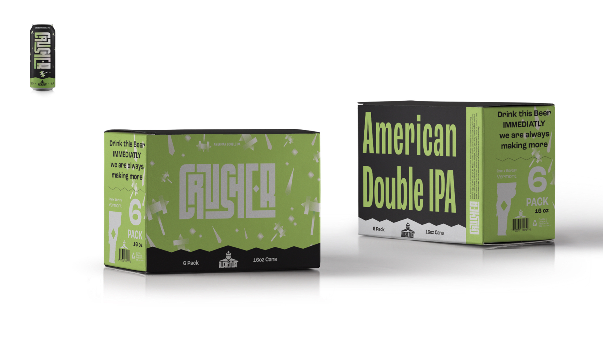
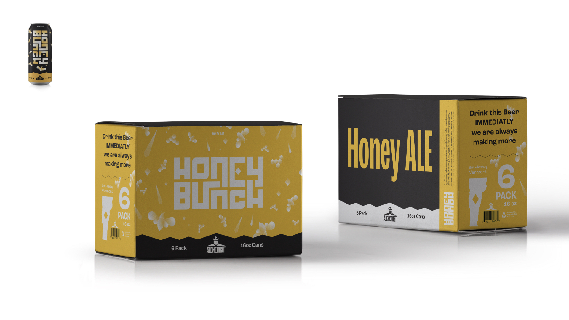
In the heart of Vermont, Alchemist Brewery has cultivated a reputation for brewing exceptional craft beer while fostering a sense of community and curiosity. When tasked with redefining its visual identity, my approach was simple: to reflect these core values authentically. Each beer type was bestowed with customized typography, carefully considered to embody its unique flavor profile and character.
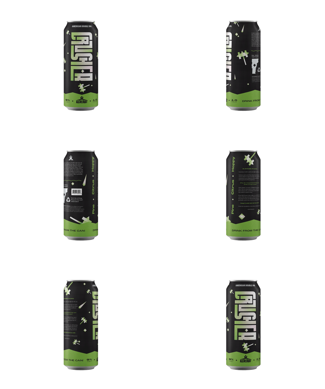
The resulting branding exudes a bold and robust system, with a touch of playfulness that echoes the brewery's spirit of experimentation. This extends beyond the labels to the packaging and can designs. Every element, from the color schemes to the illustrations, was purposely chosen to evoke a sense of warmth and fun.
The resulting branding exudes a bold and robust system, with a touch of playfulness that echoes the brewery's spirit of experimentation. This extends beyond the labels to the packaging and can designs. Every element, from the color schemes to the illustrations, was purposely chosen to evoke a sense of warmth and fun.
Logo Mark
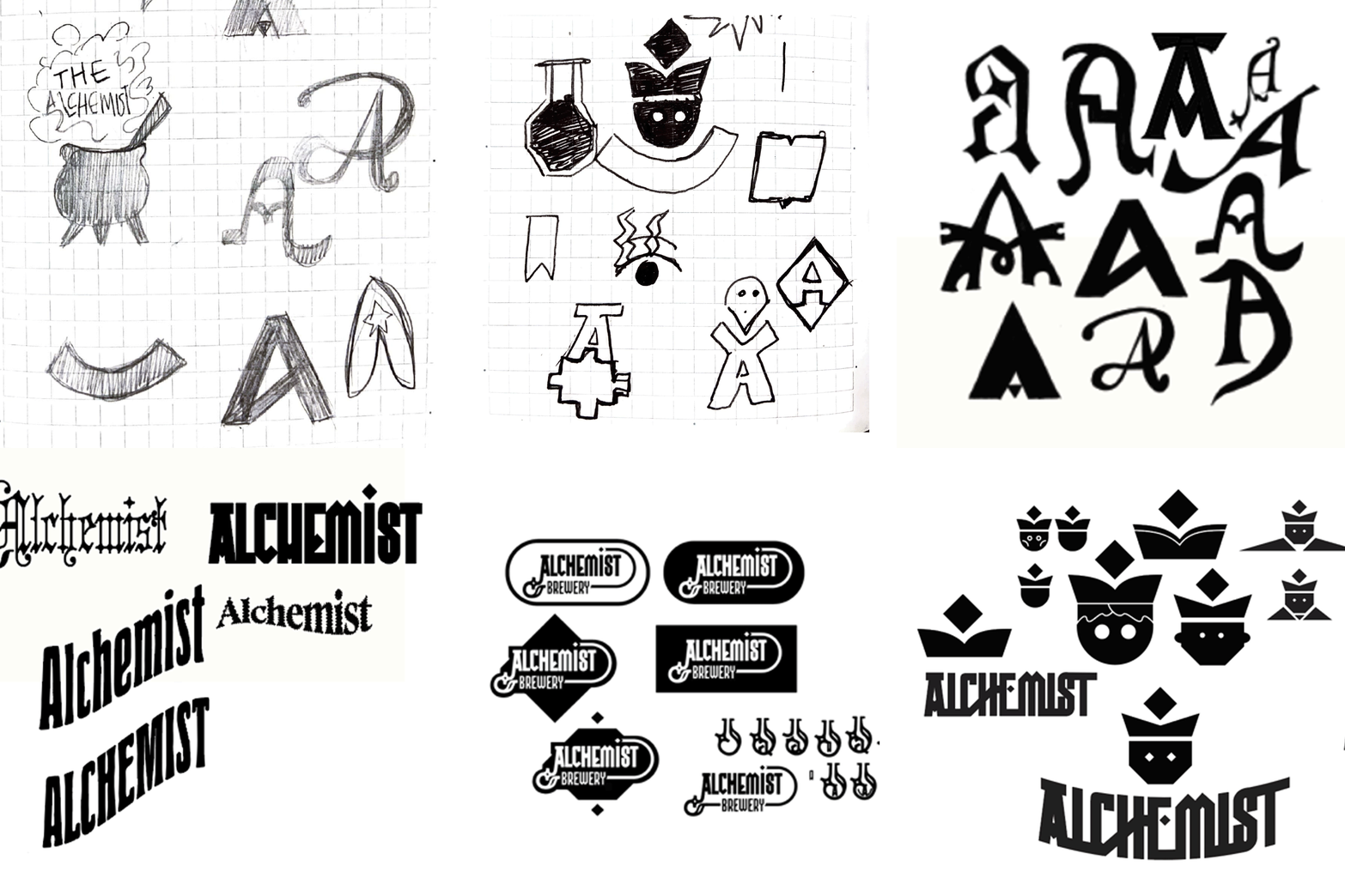
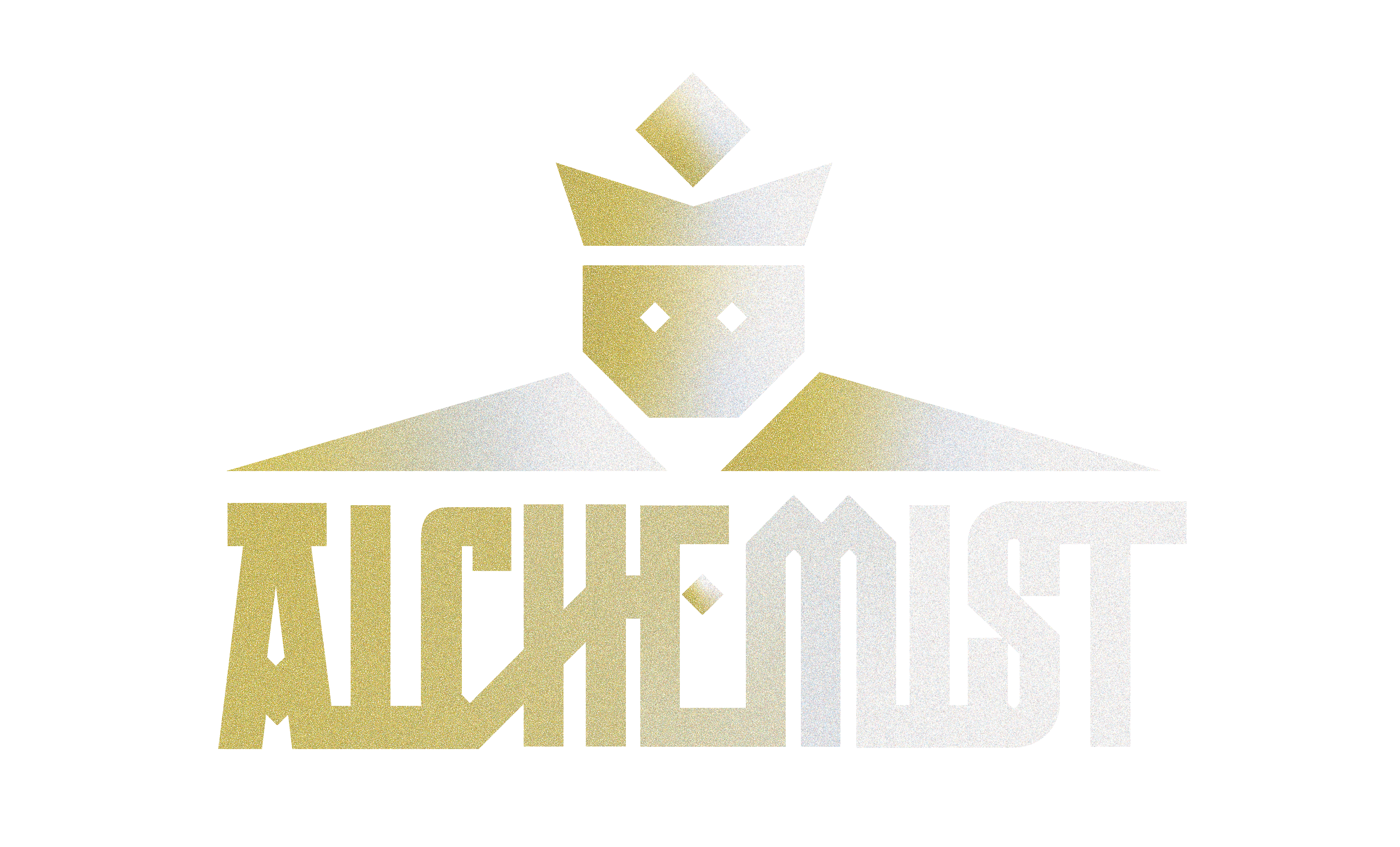
The logo mark was finalized after a lot of visual exploration with a specific focus on creating a mark that retains personality and allows for longevitey. It’s bold, expressive and allows for a variable system that can be flexbile as the brand expands.

A Complete System
The Alchemist Brewery's new identity system is a comprehensive design framework that ntegrates a wide range of brand expressions. From the bold and dynamic packaging that captures the essence of each beer to web design and captivating motion graphics, this system demonstrates a cohesive and vibrant brand presence across all touchpoints. It harmoniously blends playful imagery and custom typography to create a versatile and expandable identity that reflects the brewery's innovative spirit and commitment to quality
 .
.