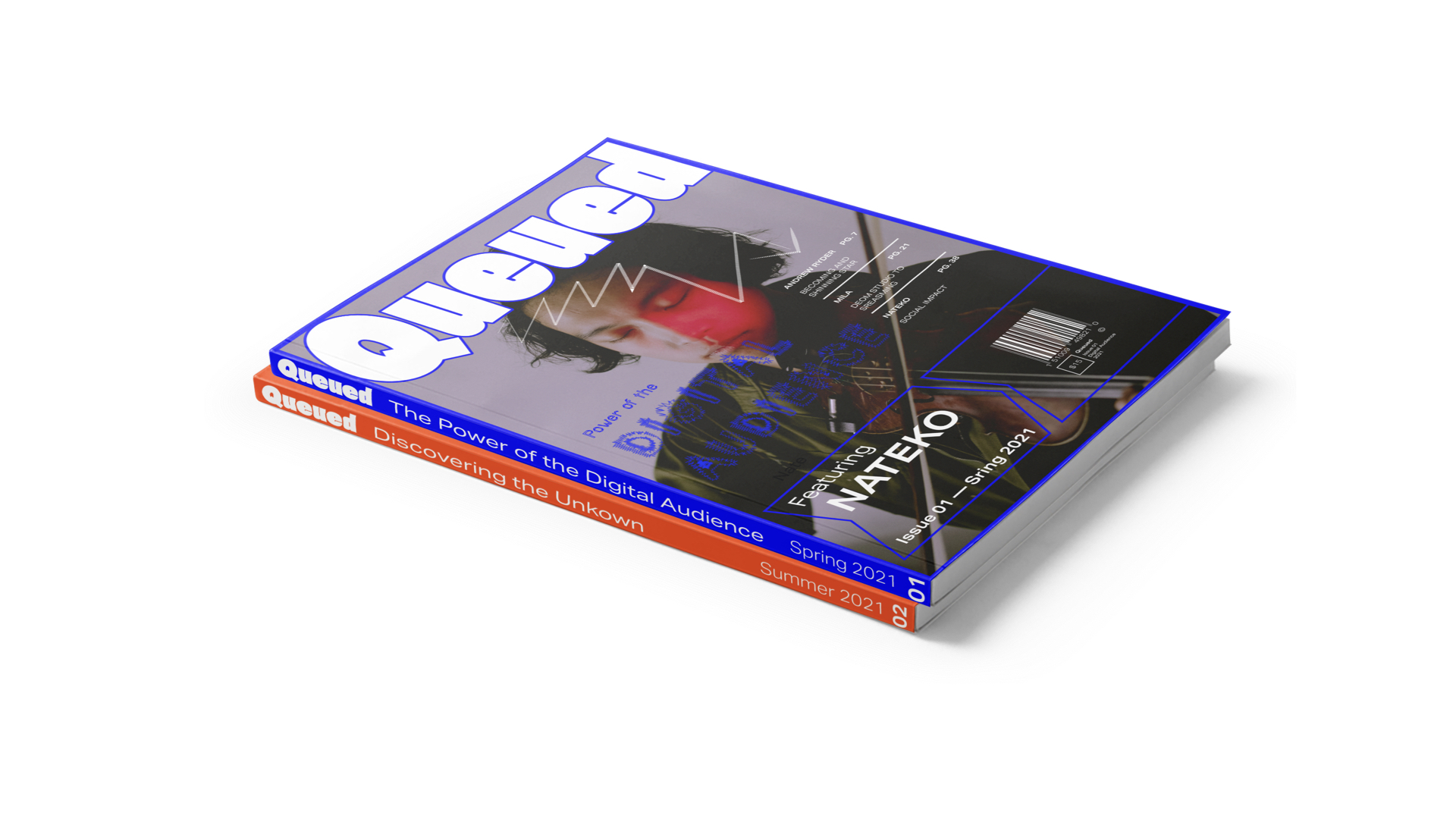
Queued
School Project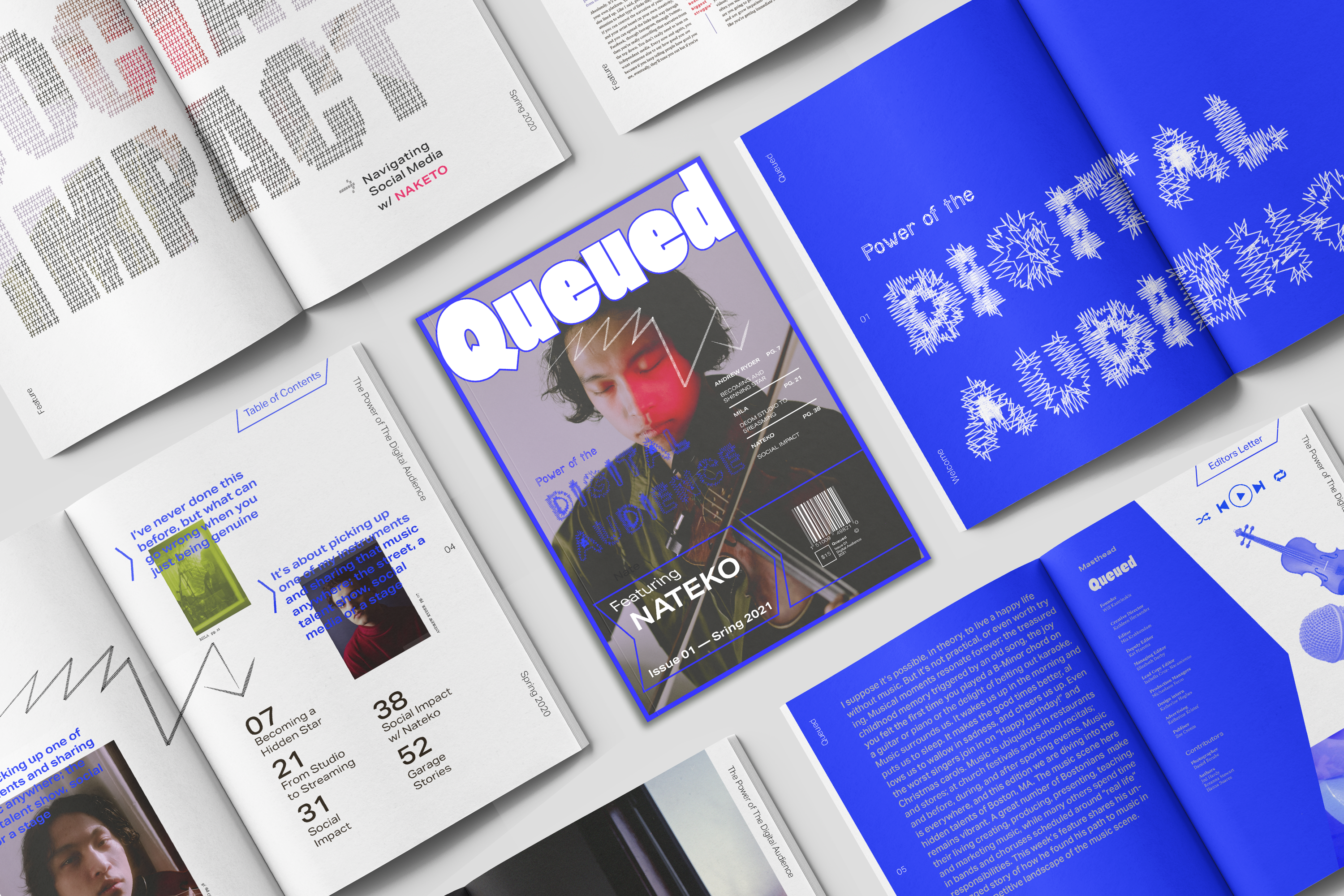
Queued
Experimenting to tell visually rich stories
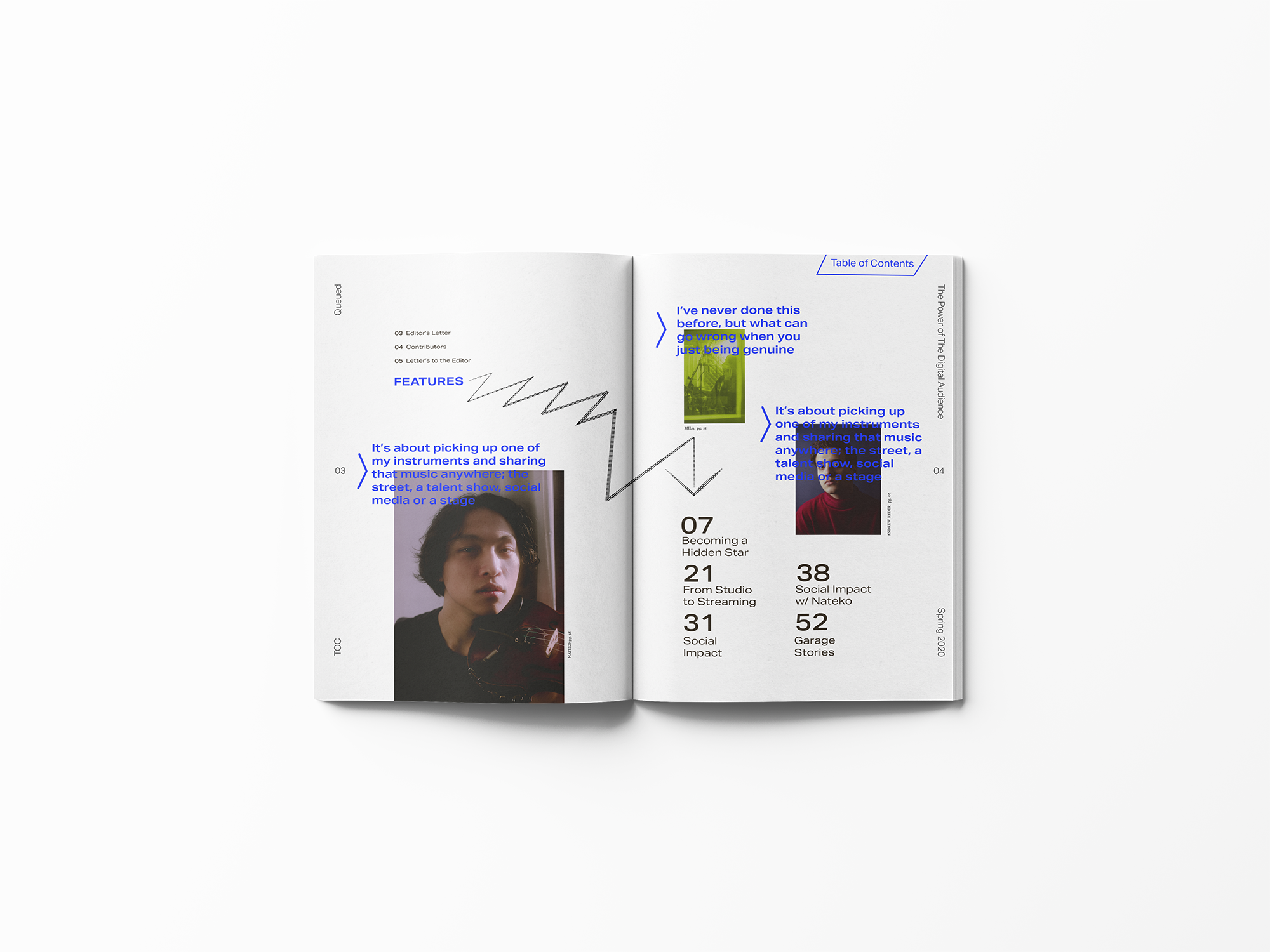
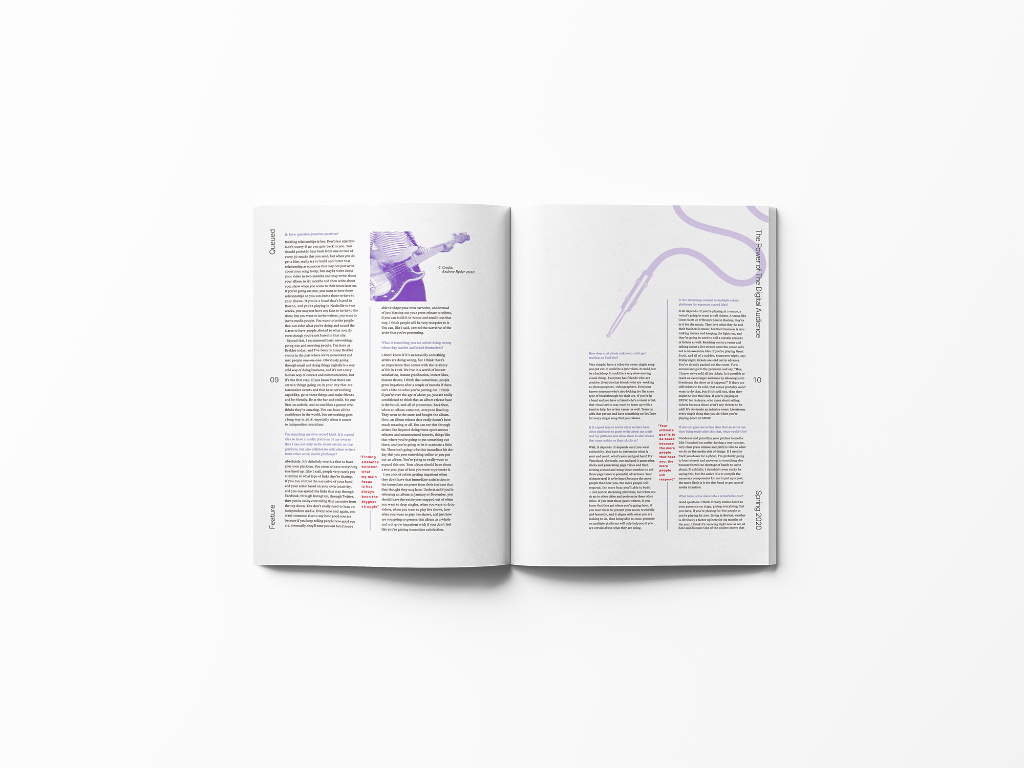
For a school magazine project that I titled "Queued," I embarked on an exploration of upcoming music news, were each edition focuses in on a diverse corner of the globe. From conceptualization to execution, I worked through every aspect of the magazine's creation, ensuring a cohesive and engaging publication.
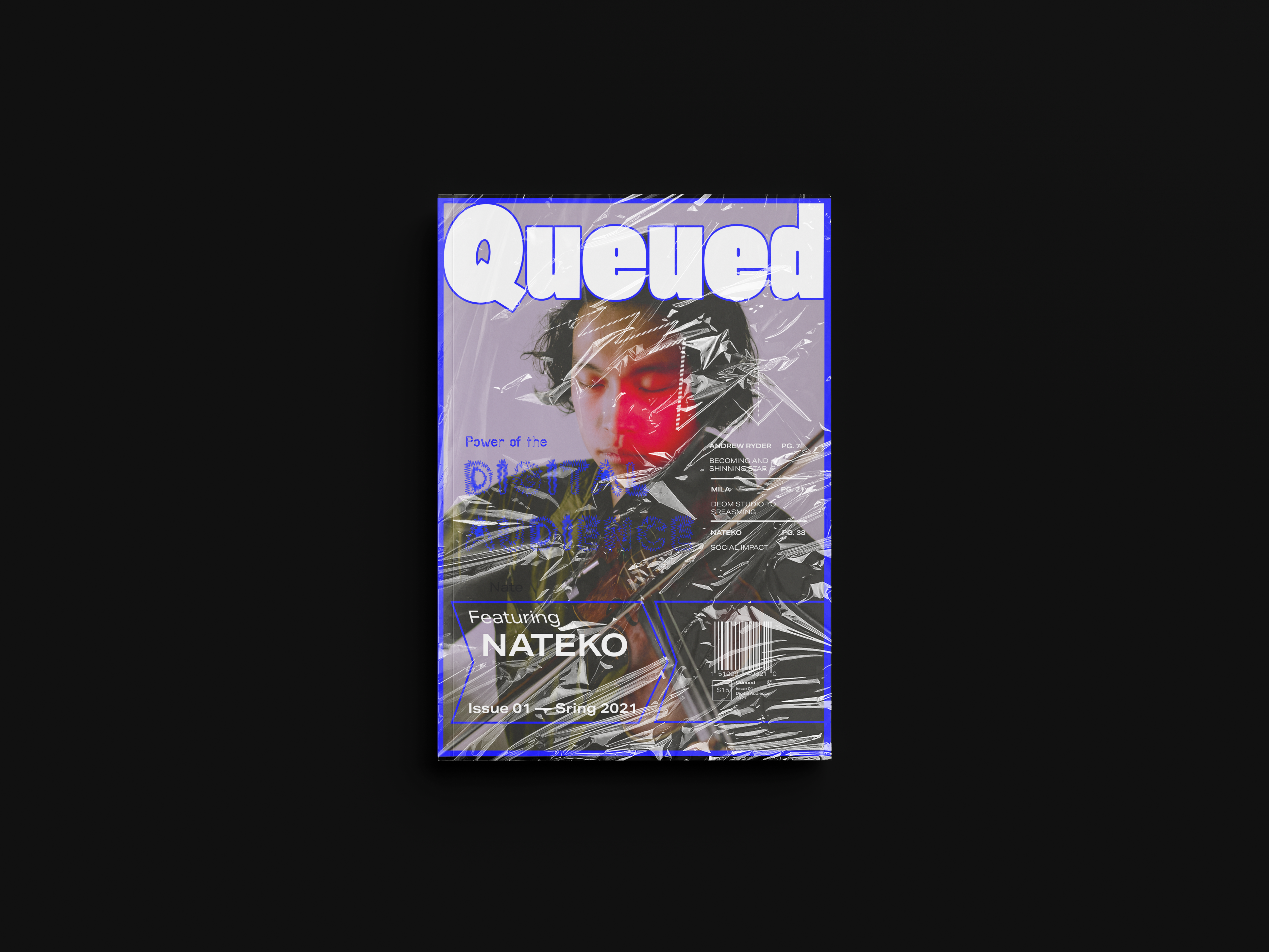
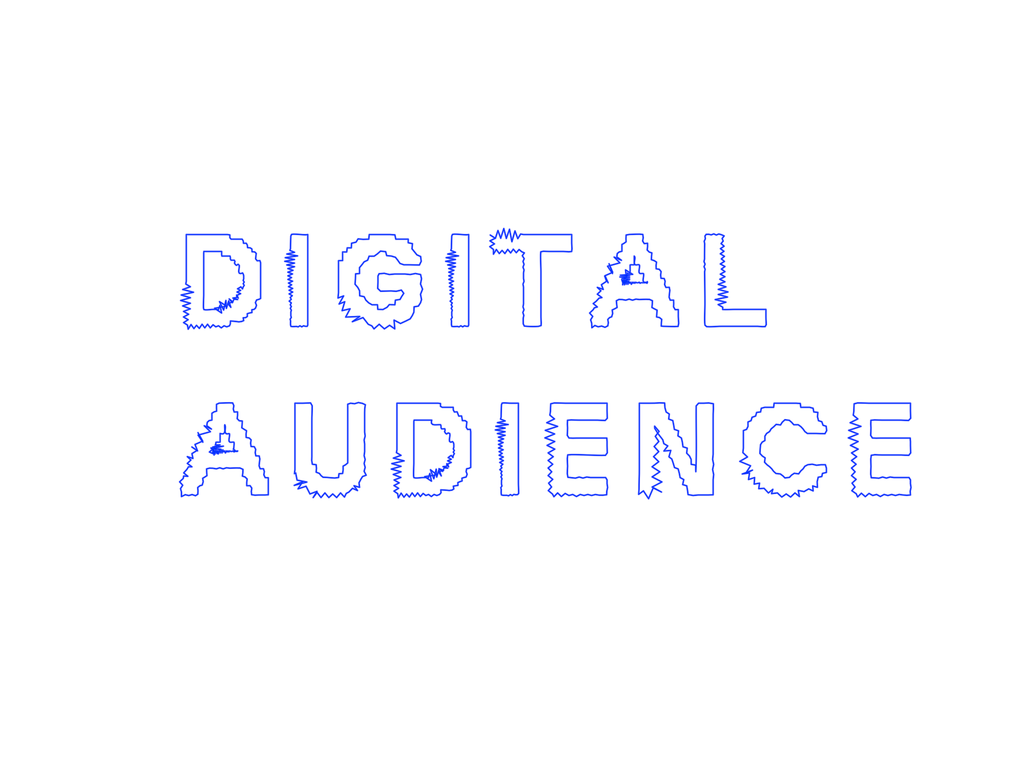
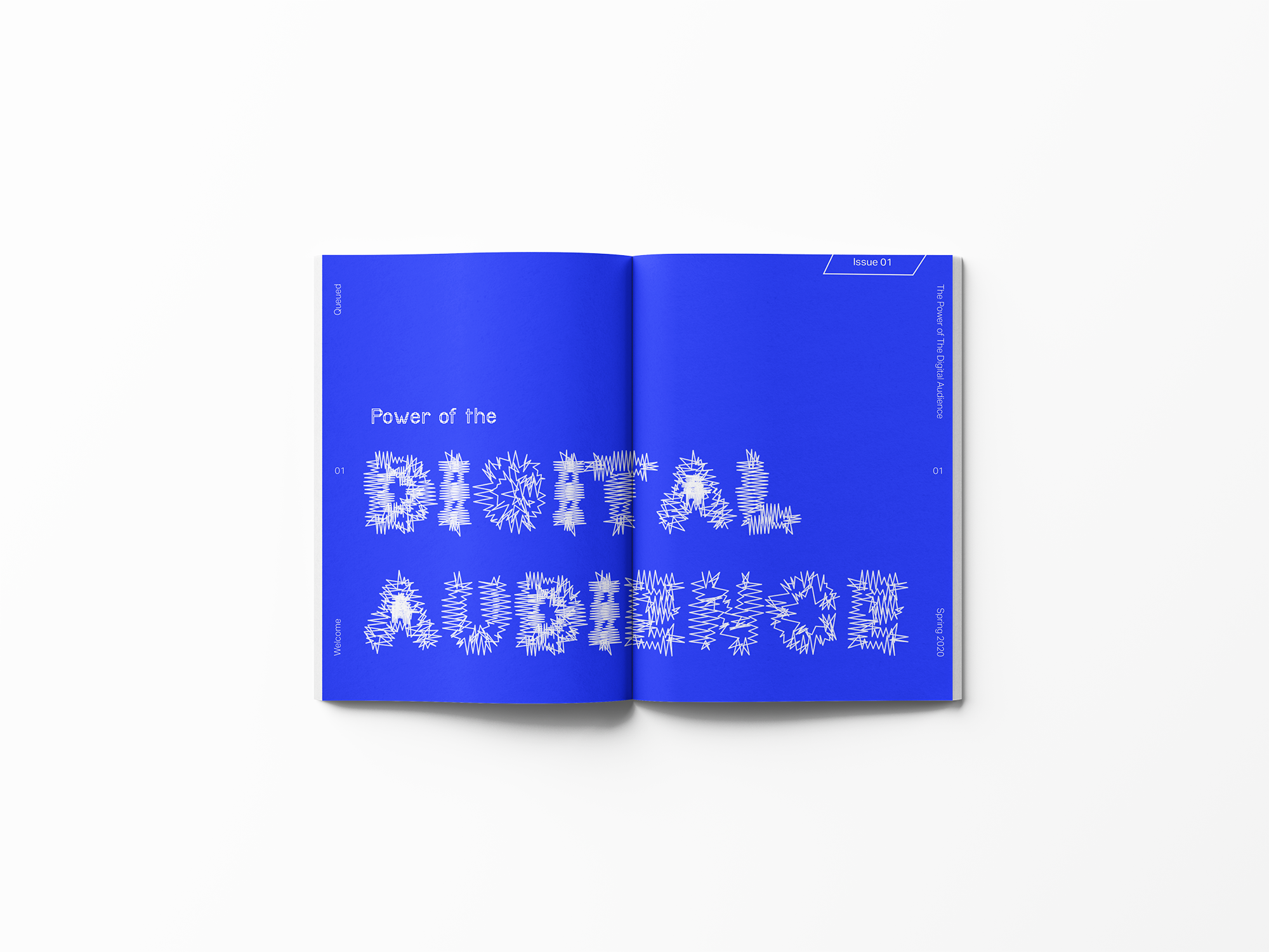
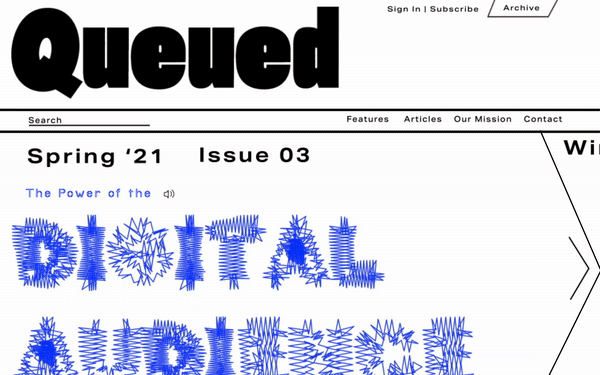
At the heart of "Queued" is a custom wordmark that captures the bold excitement of music. From page layout and design to content creation, I curated each element to showcase upcoming music trends and stories. A standout feature of the magazine was its dynamic typography, for the “Digital Audience” feature which responded to the soundwaves of the featured artist, creating a visual rhythm that mirrored the music itself that allowed for an expressive showcase in the digital space and a variable and unique array of outputs for the print edition.
At the heart of "Queued" is a custom wordmark that captures the bold excitement of music. From page layout and design to content creation, I curated each element to showcase upcoming music trends and stories. A standout feature of the magazine was its dynamic typography, for the “Digital Audience” feature which responded to the soundwaves of the featured artist, creating a visual rhythm that mirrored the music itself that allowed for an expressive showcase in the digital space and a variable and unique array of outputs for the print edition.
Experimental and Responsive Type
Experimental variability in typography opens up new avenues for design exploration and expression. By harnessing these technologies, typography can generate a diverse array of variations that adapt to different applications while maintaining a cohesive visual language. This approach expands the design system's versatility, allowing for dynamic and unpredictable yet harmonious visual outcomes. It empowers designers to create engaging and interactive experiences that evolve in real-time, enriching user engagement and pushing the boundaries of traditional typographic design.


 Web Presence